|
Tonal Layers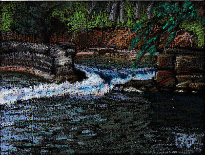
Most of my painting, Broken Dam is composed of tonal layers in various depths with different colors. It's a different way of drawing or painting than sketching lines and using line to convey your subject. Using different colors and values to create masses and shapes can become a lot more realistic even if it doesn't seem as if it would work better than lines. Tonal layers also set up for blending and burnishing techniques to give you smooth full coverage, especially in broad areas that can't be easily covered in a single stroke. The technique is powerful, almost indispensable to an oil pastelist. It helps a lot in working large. Filling in broad areas of flat color may be the hardest thing to master. Success in it begins with tonal layers. But what do I mean by this phrase? Well, tone is something you create with a pencil or stick by pressure, so tonal layers are really repeated light pressure applications. Fill in any thin spots by going over them even more lightly, or shade over them again to make them stronger instead of doing them evenly all over. With a dark color, tonal layers can create a full value scale from complete heavy coverage to the very lightest, stippled-looking area of broken color. Broken color is where the white specks of the paper, or in Broken Dam, the black specks of paper show through. It's a beautiful technique in its own right, but if you master it working on white and then want to get rid of the specks it's much easier if the color was even in the first place and the specks are all about the same size. Here's teh first step of an example of tonal layering -- a quick first stage of a pinkish Clematis that I sketched from memory. I didn't even try to remember what the leaves looked like, just drew six leaf-shaped petals and then filled most of the background with various patches of green in tonal layers. We'll examine this in detail.
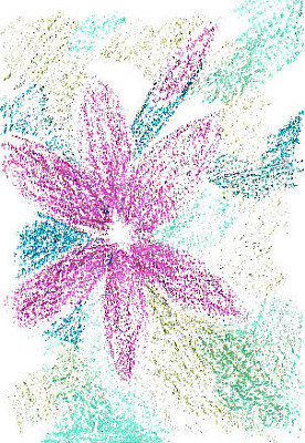
Two things let me get smooth tonal areas easily. One is going very lightly, barely touching the paper with the stick. The other is not making very long strokes or making them all in the same direction. It's most important not to go heavier on some strokes and lighter on others. When I want a smooth tonal layer, I have to fill in the lighter areas with another stroke very carefully to match the darkest stroke in the area. Look at the light green areas on the side especially, where I used two different greens that are close to the same value (how light or dark they are). If I was careful enough, I could get areas of the dark green to exactly as light a coverage as those light green areas. I did in a couple of spots, especially in the upper left. Some artists use little overlapping circular strokes to create tonal layers. That works too, the overlapping is random and keeps an unintended pattern from developing. I use short zigzag strokes to fill the area and don't usually go around it unless I'm doing something like the petals where the direction of the strokes is descriptive. Even then I don't make my strokes more than an inch or two long. If I have to cover anything wider than that, I do it in patches instead. Go over it super light, then fill in the lighter areas between any heavier strokes. It takes practice to do this but it is possible to get a smooth layer all the same color, all over a page. That's the boring practice exercise. If you want to make it less boring, break up the area into more than one shape -- circles, swooping curves, blobs -- doodle an abstract and fill in each large area with a different color. The beauty of doing tonal layers is that you can combine colors optically using them. Going that lightly makes a speckled, almost pointillist or stippled look on any paper with tooth -- drawing book paper usually has enough tooth for this, sanded papers always do. That's how I got that first painting looking so cool with very few strokes. When I wanted heavy coverage, I went back over it again sometimes two or three times in the places I wanted to emphasize or fill in completely, like the white water. Most beginners get impatient and will make very strong, heavy strokes at first, but try to fill in large areas with big long strokes across them, usually but not always in the shortest direction. The result is haphazard, there's heavy visible lines but the gaps and spaces between them create a different drawing from the one that's intended. Those unintended lines can destroy the illusion of the painting's subject, because they describe something else, not the subject. In my article on
grass texture
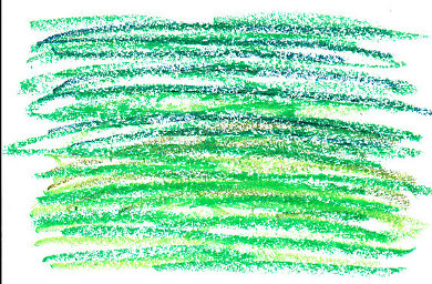
I showed how a beginner's attempt at covering a large area with smooth shaded color would look. At least how mine did before I started practicing tonal layers.
Once you have created light tonal layers, you can add more layers over them to deepen or change the color. This is better especially for practice than just going heavier in the darker areas. The best practice is to try to keep all your layers evenly light and go over them more times when you want to darken them. Let's darken the Clematis and see how it looks. An advantage of this technique is that you can add many more combinations of color into the same area without losing the tooth of the paper and overloading it till you can't add more. I added a layer of light soft yellow to a little over half the background, then added some light blue to the remaining areas. I went even lighter than on the first round, just carefully filling in all the white areas and letting the blue overlap the yellow patches too for a mixed green. The result is richer than just drawing in with those colors would have been and it's still easy to add more color. I haven't begun to burnish or blend this at all yet. Entire paintings can be done in soft loose tonal layers the way I did Broken Dam, but this is also the perfect setup for using a colorless blender to create light versions of the very dark colors in your set.
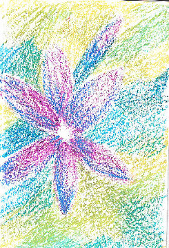
Without losing that broken color white-dotted look, I've only slightly darkened the picture -- but made the colors a lot more complex and lively. Let's see how it looks once it's blended with a colorless blender. It should have a very light, soft feeling and cover completely once it's been burnished. The moral of the story is, don't try to cover in one stroke unless it's a small area or you want a heavy distinct line. When you don't want lines to show up in the work, go light and barely touch the paper with your oil pastels. Once you're used to doing soft tonal layers, they can be used to combine any colors you have into any other color that you want, in flat areas or by gradual shading. I shaded the flower with the light blue while I was doing this second layer, that ought to be even more pronounced after it's been blended with the colorless blender. You can also use color sticks to blend, as long as they're lighter than the colors you're blending under them.
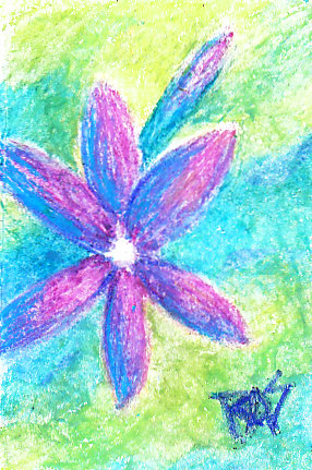
I used an Erengi colorless blender over Niji oil pastel tonal layers to finish my Clematis sketch. A few added accent strokes in violet helped distinguish the petals, and I added color to a few patches where the blender scraped them too light. This kind of tweaking is natural when you're blending over tonal layers. The more care you take to go lightly and add multiple layers before blending, the easier it is to get smooth blends. I only did two layers before starting the blending because I was demonstrating the basic principle, if I'd done three or four and built it up to middle values first I would have easily had smoother results. Still, the light colored patches in the background look more like a smooth watercolor wash than like the side-to-side long strokes of the green example. You can get a
grass texture with tonal layers
especially if the lawn is off in the distance and short vertical strokes would be too distracting, but you need a smooth fill. Either blended or unblended, tonal layers are a great way to cover any area in a picture with smooth flat or shaded color.
|


