Sennelier Mixing
Charts and Observations


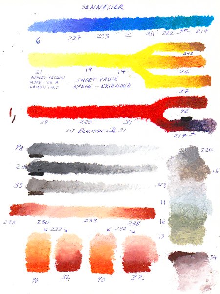
This mixing chart for Sennelier oil pastels focuses on close combinations -- analogous colors shifting gradually in hue as you might want to do in a flower or landscape, value shifts including three different choices of brown to deepen the short value range on yellow. I tested three darks mixing with a heavy application of white over loose marks to heavy concentration, with little samples of the pure dark under it for comparison.
Two proprietary Sennelier pale warm skin tones blended with three different earth reds to see which one might be good for mid-tones on skin. All three were too ruddy for anyone but a very ruddy complexion. #32 was the most natural and I could do a simple blend for a warm light complexion using #32 for the darks and #230 for lights. I create color mixing tests all the time in a less formal way, usually while working on a painting.
Wide margins can have dozens of little mixing patches as I test which blue-green shades well into a truer blue for near and distant areas in an undersea reef scene -- something the first bar tests smoothly. Color shifts from foreground to background underwater are much more dramatic than on land. Accurately getting them in will give reef scenes a powerful sense of depth.
Finding a good darkener for red is tricky when I'm doing something like a red rose or calla lily and want the shadows to go nearly to black. Violet is often a good candidate. To my surprise, 217 was lighter on the page than in the stick, it looked nearly black in the stick. Yet its mixture with #31 red hints that there's a yellow undertone to the red since it muted and darkened. It didn't look like a red-purple as I intended, it went to a neutral near-black.

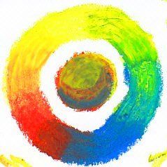
Here's my original Sennelier Primaries mixing chart, created with three sample sticks Blick sent me. I was very happy with how balanced these primaries are. I managed to get clean secondaries with all three basic combinations, something that led me to appreciate Senneliers as much as their lipstick-soft texture.
It also showed me that when Senneliers blend on the page, they do so in a painterly way. Swirling the stick around in a heavy application will eventually create a completely blended hue. It may look better to mix looser and keep streaks and visible strokes that help describe a texture or a form for strong painterly effects. In fact, "painterly" is the one word I would use to describe the working qualities of this brand.
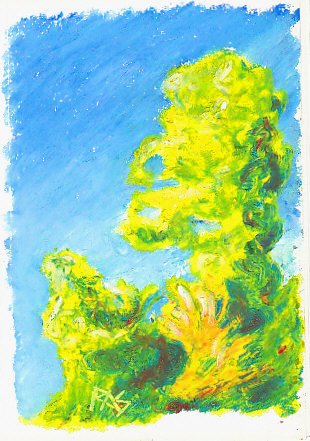
Below is a small tree study I created with these three primaries and white, showing how primary mixing can translate into vigorous painterly effects.


Sennelier's palette seems to be organized by and for oil painters. Color mixing and color theory are essential to make sense of their pigment choices. If you look at a rack of oil paints, especially traditional pigments, you'll see five or six different bright reds that hardly vary at all, then maybe one bright orange and a lot of yellows, a number of muted greens, lots of blues, lots of earth tones, a few interesting grays and more than one black, more than one white.
Instead of organizing by hue, Sennelier chose painters' pigments. Maybe it's because the French have such a long tradition of good art schools that they expect mature adults to see past an uneven distribution to the possibilities of finding your favorite red and then another one that you absolutely must have for mixing your best skin tones but would never use on an apple.
The range is very strong on primaries, fairly strong on greens and the greens are good bright ones for color mixing. There's more than one bright green and a wide variety of earth tones including green earths. So an oil painter or serious watercolorist would be able to look at the rack and just choose the color mixing palette that years of experience taught them was best for the subject.
Naples Yellow is a very pale earth yellow. It's mentioned again and again in Edward Aldrich's book Drawing and Painting Animals because the natural hue is exactly right for highlights on yellowish fur, dirt on white fur, mixes well with earth tones and is a serious convenience for all the light bits on a ginger tabby or any fluffy critter that isn't gray. It's not as important for a portraitist or landscape artist, when it's called for in a split piece of firewood it can be mixed with a bit of white into yellow ochre. It's useful because if you use it a lot, you don't have to mix some up and it is a pure pigment in itself.
Mixing colors with pure pigments are less likely to make mud because they don't have unexpected components combining to mute your results. Naples Yellow mixed with Yellow Ochre is going to give you a mid-value yellow earth color, rather than casting it toward orange or greenish grayish. If it was a hue that needed a little blue in it to get the exact hue of Naples Yellow, then it might come out greenish mixed with Yellow Ochre. Yellow Ochre itself is a little warm and orangy, so it would just come out brighter and a bit more orange if the hue had a reddish component.
This makes color mixing charts important for using Senneliers, especially by themselves. Any number of useful bright colors are absent, especially intermediate hues like that shade of aqua between blue-green and green-blue. Tints are not evenly spaced around the color wheel. Sennelier calls for a painterly approach and a thorough background in color mixing.
If your primary use for oil pastels is to create field studies for later oil paintings, Senneliers may be your brand of choice. Only Holbein and Sennelier include the Cadmium, Cobalt and other traditional artist pigments you'll find in your oils palette. Holbeins are more focused on a pastelist's palette of evenly spaced tints and they are more opaque.
Sennelier mixing tests are especially important because they include similar hues that vary in opacity. When you need a lightener, the opaque version of a light color is much more useful than its semitransparent or transparent near neighbor. When you need a light glaze that shifts hue without changing value much, the transparent Sennelier colors really shine. All of them are useful -- this kind of charting leads to understanding which ones are useful for what!
Mixing Greens

Landscapes and florals being a large part of my favorite subjects, finding good greens is always important for me. More than oranges or purples, green is a secondary so important that I've got to be sure I've got some bright greens as well as dark, light and muted greens.
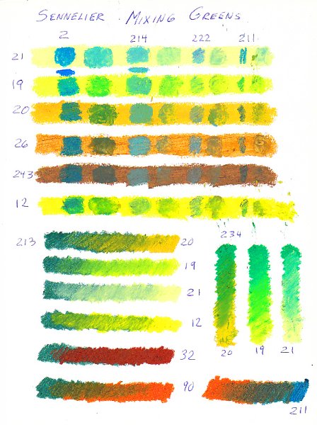
The above chart begins with six different yellows, gold and brown and four different blues including a turquoise. Different opacity really shows in these mixtures, the turquoise had great coverage compared to the dark blue at the right. The first patch of blue is over a heavy application of yellow, the second is the same with another layer of yellow over it to blend it.
Below that are some gradient bars of a dark green with different yellows and two reddish browns to see what I got with a muted complement. One of these blended to a glorious dark green with the deep midnight blue at lower right. Three more vertical bands show gradients of a bright green mixed with three yellows.
This is not comprehensive even for the blues and greens I have, though it uses all of the yellows I currently own. It explores some combinations I know from experience may result in good mixed greens or good shading gradients. When painting foliage, sometimes shading up part of the way with orange and then shifting to yellow may give a richer effect, or bringing in deep blues or browns in the shadows.