|
Perspective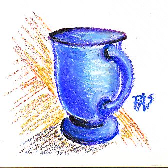
Linear perspective is a set of drafting tricks for making three dimensional objects and figures look real on a flat piece of paper or canvas. It's been in use at least since the Renaissance. The difference it makes to drawing anything accurately is striking. Above you can see a blue glass cup I sketched from life. Even with some slight flaws in the ellipsis of the top of the cup, it looks three dimensional and solid. The background behind it didn't flatten out because I didn't carefully apply linear perspective to the background sketch, just sketched what I saw at the angle the parquet wood end table was sitting to where I sat. There are tricks I could have used to make that end table top look flat like the cup's sitting solidly on it instead of seeming to be a backdrop behind it. I got very confused at some linear perspective lessons because they were hard to apply to real things I was looking at. One of the biggest problems I had with it in various books was distinguishing the horizon line -- the one you put all the vanishing point dots on -- from the actual horizon in a landscape. It didn't connect, because in some paintings the horizon isn't on the horizon line!

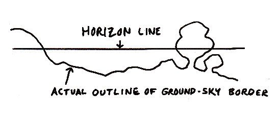
That's the horizon line. Start by sketching a line across the drawing. In one classic example, telephone poles by a road receding into the distance, the horizon line is right on the horizon. But this can be a fooler if the horizon itself is irregular with trees and hills or distant mountains in the way. What the horizon line really means in perspective drawing is the eye level of the viewer. If you sit down, look up or down, stand, tilt your head at an angle, the "horizon line" for perspective drawing moves with your head. You see everything with depth anyway regardless of where your head is. Hang your head upside down off your bed and the floor becomes your visual sky, the ceiling way below your field of vision is the ground. Little kids do this all the time because the world looks interesting that way. Grownups learn not to, and so it's easy to get locked into expecting the symbol to be the thing itself. If you look at the distant horizon in a landscape, then the horizon line and eye level are pretty much the same... and that led to a verbal shorthand that's confused beginners for ages. Here's another diagram of Horizon Line and Eye Level showing the difference.
One point perspective is the simplest type of linear perspective. It was used in Leonardo da Vinci's famous Last Supper fresco, so that all the angled lines of where walls met ceiling, pillars met walls, floor met walls, table edges, everything pointed exactly at Christ. This is a great trick for placing the focal point of your painting in dead center where by all the composition rules, it should never work. Yet it worked fine for Leonardo and produced a painting of surpassing beauty and meaning -- one that almost everyone instantly thinks of if the scene is mentioned. Here's a diagram of how to use One-Point Linear Perspective, the simple trick that Leonardo da Vinci used so well.
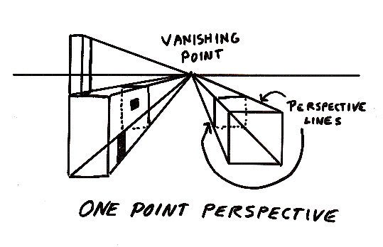
I drew all these lines in pen so that they'd be easy to scan. Don't try this if you're a beginner, use pencil and go lightly so the construction lines can be easily erased. You can see why, just looking at my diagram where I later decided to add a "chimney" to the block on the left and couldn't erase the horizon line running through the middle. All my random blocks look like they're clear. But they look three dimensional. Viewpoint in one point perspective is right there in the middle of the horizon line (eye level) and that is what everything points toward. If you had the sun rising at that point over a bunch of houses, the sunrise would be the focal point of the picture and the houses would be the supporting cast. If instead you had a still life with a lot of rectangular, blocky objects in it and one flower in a vase, you could adjust one-point perspective to make the flower the focal point of the painting. It's a powerful technique, but limited because you have to place your focal point exactly where all the lines converge. Use a ruler to test this out for yourself, and an easily erased pencil. Draw a line right across your paper, then use the ruler to sketch some rectangles and boxes. Place an arbitrary vanishing point at the middle of your horizon line. Then still using the ruler, draw construction lines from every corner of your boxes all leading to the vanishing point. Decide how deep you want your blocks to go and use the ruler again to draw horizontal and vertical lines describing the far edges of the boxes. I used dotted lines to show where they'd go if the boxes were clear, but should have erased part of the construction line from the outer lower corners of both cubic objects and couldn't because I'd inked it. So learn from my mistakes, gee, you didn't even have to make that one for yourself this time! You can even do the line from the outside bottom corner of the box last and not draw it all the way -- just draw it till it intersects the solid block and use the ruler to line it up with the corner. Just to make that a little easier to see, I redrew the One-Point Perspective diagram by penciling all the construction lines and inked only the solid objects. Then I erased the construction lines. Eye level/horizon line is dotted so you can tell the difference. These look like solid blocks.
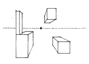
Foreshortening is the term for why things look bigger the nearer they are, and perspective construction lines provide an exact angle for how much bigger things are when they're closer. That immediately establishes a plane of vision. But all these objects are floating in zero gravity. I added a new one above eye height so that you could see the way it works just as well for objects passing overhead, like very boxy airplanes or something dangling on a mobile. Most of the time, one-point perspective goes skewy with multiple objects in a scene because it drags the focal point right to the center where I put that dark blot. It works great for a highway centered on the horizon, or a long arched hallway with a scary figure backlit at the end of it in the center, or the Last Supper. Two-point perspective is similar and adds even more depth, we'll go into that later in the article. I know you're itching to ask "But what if the things aren't box-shaped?" We'll get to that. First work on getting box shaped things looking right. The big trick in drawing anything else in perspective is to be able to do accurate boxes in perspective. What works in blocking in for landscapes, still lifes or anything is to draw construction lines for boxes about the size of the thing you're drawing, get those sized right, then draw the thing inside its invisible crate and erase the construction lines around it. Here's an example of crating something that isn't a box and getting perspective right, using one-point perspective.
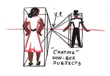
You can see that they're both standing on the same floor, and she's closer to the viewer than he is. I inked in the construction lines for boxes about their height and width and depth, then sketched the figures inside the "crates" made up of construction lines. That got them sized just right for the space they're in and established some depth to the scene. This works for trees, barrels, coffee cups, people, dogs, anything. If you can imagine a rectangular crate that the subject would fit in touching all sides (or nearly, since I added the hat afterward and let it stick out of the top of his crate), then you'll get distant figures sized right to the terrain and distant objects on a table sized right in comparison with the ones right up next to you. This was another perceptual leap that I just didn't get the first time I got linear perspective in class. No one had explained that really about the crating, we just drew cubes that looked like cubes and blocks that looked like kids' blocks and then were expected to apply it to rounded vases and weird shaped bits of grass and so on by intuitive leap. Notice that some sides of any object don't show. One habit that I had as a beginner was to always make sure any dog had exactly four legs, that any hand always showed all five fingers, and so on. This is not always the case. Sometimes the far leg is actually behind one of the near ones and won't show in an accurate drawing of the dog -- putting it in would take breaking it off and sticking it onto its stomach instead of its hip or some other toy-destroying mutation that breaks realism. The moral of the anecdote -- draw what you actually see, and not what you know is there. When you look at real things, start with buildings and printers and tables, block-shaped things that have clear angles of perspective lines. You can discover what the horizon line and perspective lines of say, a cityscape photo, are by copying it and then lightly extending those angled lines with a ruler. The vanishing point might not be within the picture, in two point perspective it doesn't have to be. But it will be there somewhere along the line that represents Eye Height, or what angle the camera was held at. This can help a lot in working out exactly how to get complex subjects to look real.
Two-Point Perspective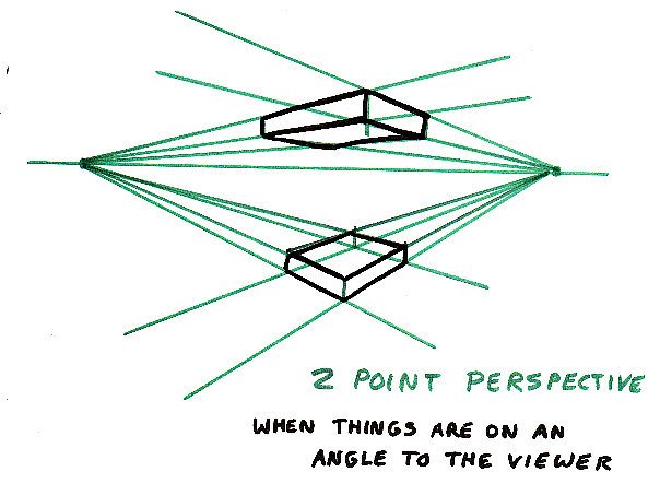
This is what to use when your focal point is not dead center in the middle of the painting, at the middle of the horizon line. You can adjust one-point perspective to having eye height above or below the middle of the picture, but you really need to have the focal point right in the middle for it to work. Otherwise things start getting distorted. The simplest perspective angle is limited in what it can describe. In this latest diagram, those two rectangular slabs could easily be "crates" to fill in with other objects -- a person floating on the surface of a swimming pool, a bird flying overhead, anything that fits your scene. The difference is that any object as you actually see it will probably have two diverging vanishing points depending on which sides of the "crate" you are looking at. One set of lines converges to the right. The other set of lines converges to the left. Either of those vanishing points could be placed way off the page to left or right, it's common to see commercial artists use string and a push pin on drafting tables to establish the vanishing point for a drawing they're working on. At least, the one who taught me years ago used to do that. The idea is the same. But it allows you to angle two faces of the "crate" instead of starting off with one face flat toward you in the picture. You can rotate buildings, you don't have to be dead center in its facade to get its perspective right. You can have roads that run at an angle -- the construction lines themselves remind me a little of a crossroads. Now when you start to angle the ground, say with putting some hills in, you may find that every building in a picture has its own set of vanishing points. Pretty complicated, but it gets easier to eyeball them in practice and start looking for where the edges converge in the distance. All the windows and doors in a building are also rectangular objects and they will share its vanishing points. Just draw more construction lines to the same points to get them right... provided that they were actually true rectangles in the first place. I found out in some sagging old buildings in New Orleans when I was drawing a detailed full-sheet graphite poster, that all the windows angled off every which way and the buildings sagged in toward the street or leaned back. That was because the ground was subsiding, not because my perspective lines were off. Using perspective lines is a way to determine that yes, that's what happened, that balcony on the old building is dangling down at one end. So if it's sagging and ratty, follow the distortions accurately and you will convey a true gut feeling of how decrepit the old place is. Old buildings fall in the category of "not-box objects crated in before you draw them as they are" rather than new buildings on flat foundations that sit clean on their perspective lines. Three point perspective works the same way. It's measured or arbitrary, and this is where crating or boxing is really important to be able to get the foreshortening right, because three point perspective exaggerates it. Comic book artists often use it for punches coming right at the viewer or superheroes flying over tall buildings seen from above. It's very dramatic and less often used in fine art, but can be interesting depending on how you look at your setup. It matters a lot if you're laying on the ground under a tree to paint it or looking right down at a still life setup on the floor, to be creative. It can be beautiful but it's only needed for those extreme angles of viewpoint, for most scenes two-point perspective is enough construction.
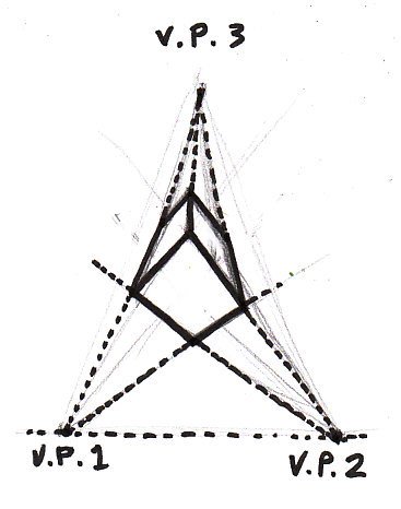
Putting a third vanishing point and adding those construction lines too will allow you to have an object rush up out of the picture or fall toward the ground. This floating cube doesn't look so much like it's floating as falling, fast. It produces a strong emotional reaction even in its most abstract form. This is why it works so well in the comics and why those giant fists splashing out of the page manage not to look unreal even if they're bigger than the puncher's head. The artist blocked in the arm as a simple rectangular cubic object and drew the fist in at the end of it, maybe drew something hammer-like with a thinner arm-width cube and a bigger fist-sized cube and turned it. You can have fun with all these perspective tricks. They add to realism in anything you draw, and once you understand how they work, sometimes you can skip doing construction lines. If you tie black cord or threads to drafting pins, you can use the pin as a vanishing point and pin down the other end to have construction lines that don't need erasing.
Always remember -- draw construction lines lightly enough to erase them completely!Most of the time, doing a few sets of construction lines will give you enough information to eyeball the rest. Objects that are at the same distance and about the same height will probably be similar, in fact a lot of times it doesn't matter exactly where you place them. If I sketched in another smaller figure off to the side in my cartoon, how tall I made him would imply how far away he was. If it didn't matter exactly where he was standing, I'd place him where it worked for the composition and not worry about the construction lines -- trusting that the perspective is true, but his exact location isn't that important. If he was bigger than the nearer man, yet feet placed higher on the page, he would look like a more distant giant. All objects recede the farther away they are. Even the ones on your table. Pick up the ruler you used for your construction lines and look at the things on your drawing table. Pick two objects that are pretty much the same size, like two pens. Set one near you and the other one on the other side of the table. You can measure the difference, holding up your ruler, in how wide they are. So this does operate exactly the same way for still lifes as it does for landscapes, and in the backgrounds of portraits it's something that could make or break realism as long as there is a background. One thing that trips up many artists, not all of them beginners, is the ellipses at the tops or bottoms of circular or oval objects. Drawing a freehand circle is bad enough. An ellipse gets even worse. A friend of mine observed that right handed artists will mess up the right side of an ellipse but not the left, left handed ones mess up the left side. This is because you have more control pulling the pencil or pastel toward you than pushing away. It made sense to me. So here is a way to work out how to do good ellipses on the circular tops of cereal bowls or swimming pools or plates. I can't count the number of times I've seen beautifully painted fruit on weirdly distorted plates -- all because ellipses are a serious pain to draw without breaking them into sections!
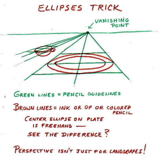
Start by establishing your vanishing points for your still life with ellipses. Decide the horizon line for the picture, remember that it is not necessarily the edge of the table, it's comfortable eye height looking at the setup. Use a pencil to lightly establish construction lines for the objects in the still life. Crate them in if they're three dimensional, but you don't have to bother crating something as flat as a plate usually. That may come out fine if you just treat it as a flat thing, depending on how much detail you render it in and how deeply dished the edges are. You might have to crate fluted plates to get them spot-on accurate. The main thing to remember in doing ellipses is that if you draw an extra couple of construction lines to quarter the distorted square that you first come up with, you can draw each quarter of the ellipse separately a lot more accurately than trying to go around getting all the quarters identical freehand. With practice it's possible to get freehand ellipses. Try a lot of life drawing, especially things like coffee cups to get more practice at seeing curves and sketching them accurately. But when you need it to be just right for a serious painting, try quartering the ellipse to get it clearer. I sketched the inside ellipse on that plate freehand and you can see that even with all the practice I've had, I don't get freehand ellipses perfect either. It's hard. This process has been described in many books and tutorials, here's a link to a perspective tutorial on ellipses that goes into it in much more detail. I will be doing further articles on rendering cylinders and spheres later on too and touch on this again. But for now, simple quartering of any ellipse at top or bottom of a cylindrical object or bowl will work. When you are drawing cylinders, sketch in the whole ellipse but only worry about getting the curve right on the front edge -- the back edge doesn't show unless it's a clear cylinder and then it's probably a bit distorted by the water or the inside of the glass. But if you get the front edge perfect by perspective, then you will find that the ellipse is flatter on top or flatter on the bottom depending on which is farther from the horizon line. Let's crate a tuna can and a tall soup can in one point perspective.
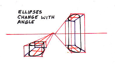
In both crated cans, you can see that the ellipses are not the same shape top or bottom. In fact the curve of the top of the tall can is the opposite of the curve at its bottom since it's about centered on the horizon line, as if we're looking right at the back edge of the shelf fairly close up. Each round or cylindrical object will have unique curves in perspective. If you quarter the flat tops and bottoms of cylinders, you will always get those curves right and make the object not only three dimensional, but undistorted and placed solidly on the plane of the table or shelf it's on. Perspective examples are always boxes and straight lines because those are what can be worked out with a ruler. But if you "crate up" anything else into an imaginary box, you can get it shaped right and placed right within the space inside the picture by accurate perspective. Enjoy! And remember -- sketch construction lines very light so they come off easily!
|


