|
Neopastel Mixing
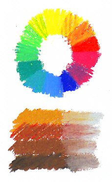
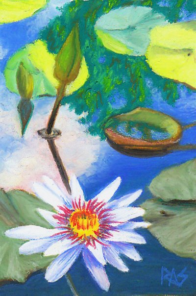
Using my twelve color set of Neopastel I've created a small mixing chart for this page. The small set does not contain all the colors of the classic color wheel the way many children's sets do, it contains the components for them because it has both an orangy red and a magenta. Orange isn't as necessary if you can mix a good orange, and violet isn't as necessary if a good blue-violet goes well with magenta. My graphic above is not a balanced color wheel. I did it freehand and didn't mark off the sections before I started, so its divisions are uneven and crowd over more toward the red side than the blue-green. Also it's flipped since most often the red goes on the left of a traditional color wheel. The bottom is a typical mixing chart with yellow ochre, red mixed with brown, brown, brown over black and gray over each of these creating four different grayed browns on the right. This is the kind of mixing chart it helps to fill your painting's margins or your sketchbook with. Like the pages of Making Marks, it is an experiment and a record of what you have and what you can do with it. Neopastels have a strong chromatic palette. This is a designer's color mixing palette, where the color wheel gets split not just into primary, secondary and tertiary but a lot of beautiful intermediate tertiary hues and subtle muted colors and neutrals in larger sets. Sets of gouache have a chromatic palette like this. Caran d'Ache echoes that arrangement in the tints, which are all about the same value and evenly spaced around the color wheel on a shorter range than the masstones (pure pigment). Neopastel also has a good variety of darks, some are shades (pigment mixed with black) and others dark pigments that could be arranged the same way with the exception of yellow, unless you bring in Yellow Ochre for the darkest yellow and orangy browns for dark oranges -- a system that works well. It's reflected in how their sets are laid out. You see the masstones in medium value in chromatic order. Then a set of tints in repeated chromatic order. Then the neutrals come in marching around the spectrum to scoop up muted and dark versions of the cool colors along with the browns, and some value-scaled grays grouped at the end. A color mixing strategy based on that designer-chromatic approach, which got organized in Munsell space and some other complex color theories as a way of describing color, lends itself to analogous mixing. Analogous colors are right next to each other on the classic color wheel. Any analogous mixture will keep its brilliance. To mute a color, add some of its complement from across the color wheel or a near-complement. I found while working on exact color matches on Colourfix paper for Water Lily, that Neopastels blend well even in combinations of four or five different sticks to achieve exact hue and value matches. Some other brands might have made mud or saturated the paper by that point. Thanks to the sanded surface and even Neopastels texture I was able to get the muted dark blue-greens in the water toward the lower right and the gray-greens of the leaves without having any colors that mixed directly to create them. Throughout Water Lilies I was able to use only the 12 chosen mixing colors of the small set to get anything I wanted.

Neopastels in a Larger RangeI will be adding more mixing combinations, gradients and sample crops or artworks when I get a larger set of Caran d'Ache Neopastels. Till then, I'll continue exploring what's possible with only the twelve well-chosen colors in my pocket set. These are my favorite artist grade oil pastels, so you may not have to wait for long. Update: I invested in a 48 color set at the start of February. While I've charted it and you can see the new colors on my Neopastels review page, I haven't done a new artwork with the big set or done a mixing chart yet with its interesting possibilities. My big new set is divided evenly between a bright chromatic range, a full spectrum of tints so I'll have much more freedom doing lighter value combinations and neutrals with some interesting dark greens and blues. I have more grays at my disposal too and any of them are good mixers to mute colors. So you will soon be seeing a couple of new graphics on this page.
|


