Composition

Applying the Rule of Three
Composition is a difficult and subtle aspect of drawing and painting. It's what makes the difference between an accurate, well painted picture and one that people will actually like. When it's off, people may not be able to tell you what's wrong but something about it will bug them and they'll pass it by for a less skilled drawing that has a good balance.
The Rule of Three
Beginners will find the "Rule of Three" helps a lot. It's not the only way to get a good composition, but it's a way that never fails to work when it's applied.
A good drawing or painting has a
Focal Point.
The focal point is the most important part of the image, it's what people look at first and come back to again and again because it carries the meaning of the picture. If you put a house or a figure into a landscape, it may become the focal point because people are interested in other people and their habitations.
A good composition only has one major focal point. This is important to remember. Dividing your viewer's attention between two or more can confuse them and make the picture irritating in ways they can't put their finger on.
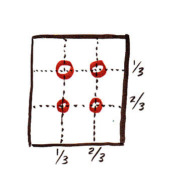
If you divide the rectangular area of your picture in thirds vertically and horizontally, that's the basis for the Rule of Three. It works for any shape of rectangle or square picture and can even be adapted to ovals and rounds.
The places where those pairs of lines intersect are four perfect spots to place the focal point of your picture. It doesn't have to be exact -- in fact one other good composition scheme pushes them a little up and to the sides with good effect. The main thing for beginners to remember is that if you use any of those four points for your focal point, your picture will balance well.
The house has some intrinsic interest being a house in a landscape of nonhuman things. But if I wanted to accent this in a serious painting, I'd also put the strongest contrast of light and dark at the edge of the house and its roof. That's one way to get attention to the focal point. I might also use a color contrast of red roof and green foliage behind it to draw attention to that point. I'd use the most detail in the house and its immediate area rather than the foliage on the hill to the right or the clouds.
You can make clouds or trees your focal point. It's up to you what it is, that depends on what you want to say with the painting. But be aware that some things draw attention more than others. Detail, contrasts, bold colors, warm colors and directional strokes are all ways to bring attention to your focal point.
A painting with more than one focal point gets confusing and that can irritate a viewer even if they don't understand why. As an artist, it helps to remember to simplify things more as you leave the focal point and put your attention and best work into it. Decide at the start of the painting what the most important thing in it is, and set it up accordingly.
Here's an example landscape in Pitt Artist Pens showing how I placed the house at the Rule of Three point, it's the example I was referring to earlier. This sort of thumbnail sketch is a great way to plan a composition for a serious painting.
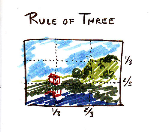

This Pitt pen landscape is just a planning sketch. I could develop it into a good oil pastels painting later, but I made it up at the moment to show what I mean by focal point and Rule of Three.
I used light and dark contrasts (dark red against white) to make the house important. I used warm colors -- the dark red is the only red in this sketch. I reflected the object in the pond -- the reflection is another thing that draws attention to what's reflected and is the most detailed part of the pond. I contrasted red and green with the house's red trim and green foliage behind it, another attention getter. Plus, it's a house -- people like seeing houses in landscapes and their attention and curiosity gets drawn to guess who lives there.
I followed some other rules in this one too, just out of habit.
No Kissing!
Nothing in this sketch exactly touches the edge of the painting or something else. That's what "No Kissing" means. It doesn't mean you can't draw lovers kissing.
If you do, their heads should not stop just at the edge of the picture. Either let the heads go right off the edge the way I did with those clouds streaking across the sky, or stop before they get to the edges the way the reflection of the house stops before it hits the bottom edge of the picture.
Whenever an element "kisses" another element within the picture it's bad too. Either overlap them and push one forward or separate them with at least a little space. This is tricky if you don't plan for at least quarter inch of matting space around your oil pastel painting, because a quarter of an inch will prevent kissing -- but once the mat is on, you may find yourself having to slide it up an eighth of an inch to keep something from kissing on the top.
I learned this one the hard way on a lot of portraits. So make the heads in portraits small enough not to hit any of the sides or big enough they go outside the picture. Elements that go outside the picture the way that hill and lake do are not a problem. Then it's more like looking at the scene through a window, the frame is your window and the viewer isn't distracted by it.
"Kissing" elements draw attention away from the painting and to the frame itself. People may not get it why this bugs them, but it does and it'll ruin even the most perfect painting if you let things kiss each other or the edges.
When people are actually kissing, their faces overlap. Someone's nose is behind the other lover's nose. Lips press together with some pressure, they don't just touch. Hair from one goes behind the other lover's face. So this principle of No Kissing applies even if your painted lovers are kissing -- it's not about what they're doing, it's about what you do as an artist and how you present them.
Here's another tip with a portrait sketch as example.
Darken the Corners
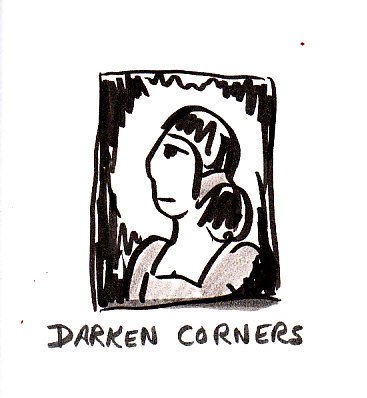
This one isn't necessary. But it works very well if you can do it! On portraits it's especially effective, because you can have the backdrop be something vague like a painted backdrop or a curtain, or just a shaded color behind the person.
You can get this effect in most photo manipulation programs too, softening all the corners to vignette the picture. It's very effective and if you use a vignette effect, what's in the middle of the painting will come out brighter and more vibrant by having more contrast and detail.
The lady's profile would almost look haloed if I used this little sketch to do a real portrait.
Also, cool colors push back and warm colors push forward. Bright colors come forward and muted neutral ones or faded ones come back. So if I had a pale denim blue background, her skin tone would bring the lady forward while a blue dress would both make her skin look warmer and push attention toward her face.
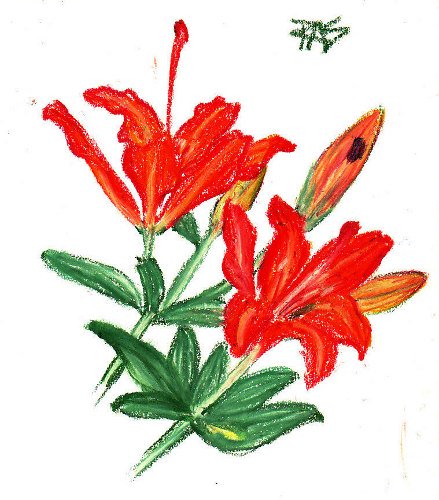
There are a lot of tricks like that to remember in creating a good composition. You don't have to use all of them in the same painting, but I can't think of an exception to No Kissing. There are plenty of exceptions to darkening the corners -- anything on a white background like my Day Lilies sketch isn't going to have that.
But if I gave them a dark background and shaded it to black at the edges, fading out the stems as they approach the vignette, it'd be very dramatic. Also, try laying a Rule of Three grid over my day lilies -- you'll see that without thinking about it, I placed the lower flower where its center falls right on the Rule of Three point.
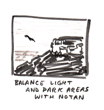
For my final composition example, I sketched a
Notan
to plan the composition for a real painting I'm doing in oil pastels for a local friend who helped our family move in. Barbara has a favorite lookout point on Mt. Petit Jean in the nearby State Park of that name. I've been up there twice for photo references and sketching, most recently yesterday. My next version will be a small oil pastels painting.
Notans are useful because they can help you work out a good composition in a one-minute scribble sketch in light and dark values before you even get out your oil pastels. You can do one with a ballpoint on a napkin, or a ballpoint and a couple of gray markers. This one I used gray Pitt Artist Pens.
Notice that I have massed all the dark areas in the painting in one big scribbly dark blob -- the cliffs, the forest under the cliffs and the little house she grew up in that is on top and is the focal point is right on one of the Rule of Three points are all part of the same dark mass.
I had to choose how much of that forest to show. I could have pushed the horizon line up very high so that most of the painting was dark green trees -- and that would have been fine if I didn't want to make the house the focal point. So instead, the forest and cliffs that are in front of some distance-faded fields and a lot of big blue sky are the slightly smaller area.
The shapes are pleasing even when you can't see the little house in detail. I put a turkey vulture hovering in the sky because I've seen them on both of my trips and know they live around there launching off the cliffs to glide. Barbara likes those big wheeling birds, so I want to make the experience of her favorite lookout true to its feeling as well.
Contrasts in the distant fields are very slight and everything there is blued by atmospheric perspective. I couldn't even see the horizon distinctly, the light blue bottom of the sky faded into distant mists and other mountains in a great soft edge. But the cliff itself with her old house on it is going to be the most distinct.
The whitish areas under it are actually a middle value warm reddish rock, coming out against the green foliage. The house is built out of the same warm rock but jumps out against very dark shadows and very dark trees in another sketch I did of it and in life.
So choosing a composition when planning a painting is a matter of deciding how close to come to the subject. Where to put your focal point in the picture and still get everything else you want in it. I do want to show some of the valley beyond since that helps establish how high that cliff is.
Where you stand or sit and the angle that you point a view finder or camera is how to choose a composition when you're looking at real things. Composition skills become intuitive over time too.
Little kids mysteriously have great composition skills. So what makes people pleased by some arrangements in pictures and annoyed with others must be very deep in the human psyche. Kids lose this skill as they grow up and regain it as grown artists by practice.
The other great news about studying composition is that even if an old picture has a problem -- sometimes you can solve it by cropping it smaller. Let's say you did draw two lovers and had the top of their heads touching the top edge of the picture. Why not cut a smaller mat opening so that the top of their hair is cut off by the picture? Or cut an oval mat so their faces together are framed by a friendly oval that goes through all their hair to solve the problem?
Most of the good books on oil pastels that I've reviewed at least touch on composition and some go into some detail with it. I hope this helps you get started on learning good composition. Books on photography are also very good for it, because the difference between a great photo and a rotten one often just rests on exactly how the photographer chooses to hold the camera and zoom to get it balanced just right.
Have fun testing out your composition ideas with thumbnails and notans, then when you put some work into a serious oil pastels painting you won't have balance problems sabotaging your best creations. Enjoy!