|
BlendingBlending oil pastels can be accomplished in any of several ways. There's optical mixing using pointillism, crosshatching and other textures explored in my Shading lesson, and there are two techniques specific to this lesson. Blending and burnishing are very similar, they take place at different stages of the same process. In some ways oil pastel is a bit like working with colored pencils but oil pastels are softer and it helps to work larger. Both of these things make mixing easier. These techniques work well for colored pencils too. To show that blending is possible with student grade oil pastels as well as the softer artist grade oil pastels, I used a 48 color set of Mungyo Gallery that I bought at
Jerry's Art Supplies

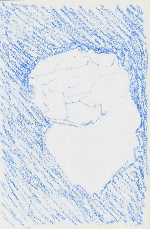
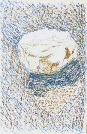
After the initial sketch, I started bringing in other colors to mute and tone the gray. I wanted a darker shadow than the background and to keep the shadow shape distinct I didn't fill it at the first stage, so I filled it with a darker blue on this stage and then used brown over both the shadow and the background to mute the blues to something more like gray. This is optical mixing. Blur your eyes to look at it and see them mix in your mind rather than on the page, or stand back from the screen. I just crosshatched lightly scribbling one color over the other and the combination averages out to more of a cool gray than either would've been alone. I worked over some of the darker areas within the stone with the brown and with a light gray-lavender.

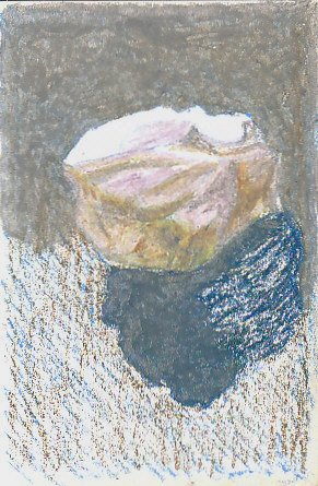
In stage three, I finished adding indigo blue over the brown part of the shadow and started blending. On the top I used a light gray for blending, also in the shadow areas of the stone itself. On the shadow I used a darker gray. You can blend over loose applications with any light color, mixing them together to make a smooth texture. Press hard with the blunt end of the stick. If it still has clean edges this is a good time to turn it vertical to the paper and make small circular motions while pressing hard. Go back and forth several times over the same patch, overlapping your previous strokes. This mixes the color that's already on the page and pushes it around to make a smoother combination. Burnishing does the same thing and takes the same motions, the difference is that it's done after the area is saturated with heavy layers. By adjusting the direction of your short strokes you can help describe the surface of what you're drawing. Be aware that following outlines that aren't solid shapes like say, the edge of the shadow on mine, may break the impression they're flat and make them look like solid objects. Flat background edges that have long heavy strokes following them pop to foreground and don't work as background well. This may be an effect you want sometimes if you're not going for realism. So pay attention to the direction of your strokes and when you want smooth directionless application, keep them short and circular or short and going in all directions so the eye isn't led one way or the other. 
Above, you can easily see the texture difference between a blended background area and the crosshatched loose application of my early sketches. Try patches of different color combinations shaded into each other on scrap paper, especially if you're mixing colors to get a third hue that isn't in your set. You might be surprised at some of the combinations that work. Remember, when anything is too bright, mix it with a little of its opposite on the color wheel. When an area is too dark, burnishing with white will lighten it a step or two but not all the way up to white. Keep areas of white paper clean and go over them with white oil pastel before anything else if you want to be able to keep them white or scrape back to white. To see more progress on White Rock, and the completed study, read through the
White Rock Blending Demo
where I use these techniques again and go into detail on the colors used to create the project.
|


