|
Art Lesson -- White Rock Blending Demonstration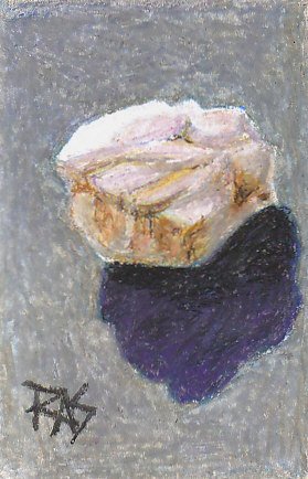
White Rock by Robert A. Sloan using Mungyo Gallery oil pastels.
You can get these oil pastels at
Jerry's Art Supplies
If your oil pastels are harder, press harder or go over areas more often. Sometimes individual hand pressure can produce very different results, so experiment until you get the look that resembles my examples. In this art lesson we'll be looking at color mixing, shading and value adjustments as well as blending and burnishing. Now let's have a look at where this rock study began:
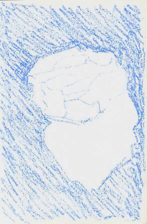
The color I used for my initial sketch is Mungyo Gallery Sky Blue, a medium light blue. Not the lightest blue in the 48 color set, the third lightest. I wanted it strong enough to show up and tone the page, but light enough to be easily blended with anything else I put over it. Why blue? Because the rock is white. Blue shadows make white look brighter than gray shadows or any other hue, there is a bluish hint to most shadows. You can do a high intensity painting using vivid blue for all shadows and come out with a plausible snow scene that makes the whites whiter. I knew I'd tone it down, but the blue is the right color to establish where the areas are and begin the mixed blue-gray background I wanted in the final version. If this is confusing, you can review my art lesson on Color Theory. It goes into why certain colors push forward or recede, what mixtures will become brighter or duller and what the cool colors are. For now, just remember that complements become duller. There isn't a blue-gray in the Mungyo Gallery set. It's there in many other sets, it may appear in some 24 or 36 color sets, it wasn't included in this one. So blue-gray became the first combination color this art lesson tackles. I filled the background loosely with directional strokes, keeping the angle reasonably consistent so that I could more easily create a smooth texture and not have distracting "halo outlines" coming around the subject. I didn't fill in the shadow area because I knew I'd want to start that shadow in a darker color. I drew this stone from life in very bright sunlight on a cool gray surface where the dark shadow was very distinct, the strongest value contrast in the whole setup aside from a tiny dark area to the right on the rock. When you do the project in this art lesson, begin your rock about 1/4" or 3/8" closer to the left. I underestimated how close the shadow would come to the edge of the paper and didn't want it to "kiss" the edge, so I wound up having to draw right to the edge of the paper instead of leaving a 1/4" matting edge around it. This study will stay in my sketchbook, but if you want to mount yours and mat it, be sure to give some space between the shadow edge and the right side of the page or let the shadow go all the way over the edge. 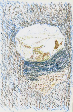
I've begun toning down the blue with Dark Brown. Brown can function as a complement when it leans toward orange, so I chose a fairly warm brown, a less reddish brown can be used when you want to mute violet to gray or a neutral. This creates some optical mixing and in thumbnail this already looks like it's got a gray-blue background with the rock popping out as much whiter. In the shadow, I covered it with the brown hatching and then started adding Prussian Blue over it to create the same mixture at a darker value. (Value is how light or dark an area is in a painting). Prussian Blue is a greenish blue, so mixing with the brown gave it a slightly greener look than it would have on its own. I didn't like that so I'll correct it in the next stage after filling in the entire shadow. I also used Dark Brown lightly into some areas on the shadow side of the rock itself. One of the main things to remember from this art lesson is this: White objects aren't white all over. If you just kept it all white, it'd look like a cutout rather than a stone. So by putting Dark Brown lightly into some of the nooks and crannies, I prepared for the rusty warm streaks that showed within the shadow and to give it a soft glow at the later stages. I can always gray that brown by adding blue or violet. In my art lesson on Shading, I go into value more thoroughly and how to create hard and soft edges. Some of both will be used in this rock study.
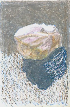
Stage Three of this art lesson shows blending with a light color to create a smooth mixture. On the background, I first added some Violet and Ultramarine Blue in very thin light layers over the brown. Then over the upper part I blended both with heavy pressure using Gray, the lighter gray in the Mungyo Gallery set. I pressed hard using short circular or zigzag strokes. Where patches of color still looked too bright I went over them again. I overlapped with previous strokes to get smooth coverage and eliminate as many white specks as possible with Gray. There are still variations in this burnished area but they are a lot less dramatic than they would've been with a lighter application. If you have a Colorless Blender stick you can apply all the colors lightly and then use that to blend them into a smooth mixture. If I had wanted to vary the background colors, I would have put different proportions of the components in different areas and let them blend smoothly into each other. On the shadow, I blended the Prussian Blue and Dark Brown mix with Dark Gray. I brought all these colors up into the shadowed side of the rock and touched them into its nooks and crannies where it looked cooler or warmer. Then on many shadow areas I blended with Gray, others I blended with Gray Rose. I put some Gray Rose into the white and highlight areas too as it's light enough to be shadows within light. Once again: the moral of this art lesson is that white isn't white. Gray Rose is very light and it makes the brightest highlights shine out as even whiter by comparison. Always look at the real colors of the shadows on a white object. Gray Rose is very close to the lighter colors around the whitest highlights on the real stone.
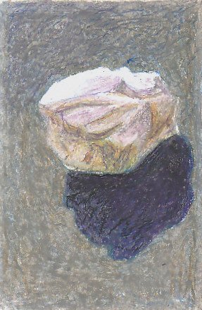
Stage Four of this art lesson begins with the shadow. It just isn't dark enough compared to the shadow of the real stone in bright sunlight. It also looked greenish. So I layered Violet into it somewhat heavily over the dark gray blending, decided that wasn't dark enough and added some Black. I used more of the Black closer to the edge of the stone and shaded the shadow lighter as it moved away from the rock. A good close look at the shadow in the real setup showed me this is exaggerated -- but not too far. It's one of those things that in a painting can make it look far richer than just having a flat shadow area. I finished filling in the background and unified it by bringing more of the colors up into the shadow side of the rock. Then burnished the entire rock with Gray Rose except for the areas of white highlights. This muted the dark crannies a bit, but I will strengthen those in the final stage of this art lesson.

To finish the project for this art lesson, look at it carefully. See where there are areas on the stone that need darkening or lightening. Compare your results to the final version. If you want to set up your own stone and just use these colors, it's even better to use the art lesson as a guide to creating your own still life. The last stage is refinement. Touch in more darks lightly where they're needed in the crannies and crevices of the stone. Shade the shadowed side of the stone carefully to match the original or your real stone. I used a little black into the darkest spots, going very lightly into places that already had heavy layers of oil pastel. In most of them I went over it again with another color to blend it in. I burnished over the highlight areas on the stone with White and the entire background with White, lightening it a little. I darkened the shadow and blended it some more with Black and Violet. I began to pick out the warm iron oxide stains on the shadow side with Ochre (Yellow Ochre) Burnt Umber and Dark Ochre (red ochre or red iron oxide, any of the earth reds). Burnt Umber in the Mungyo Gallery set is not the dark brown that I'm used to seeing by that name, it's much more like Mars Orange or another earth orange. So don't go by the color names so much as the colors you see that resemble what I used or mix to what you see in my version -- or to what you see on your own stone. You may not have as many iron oxide stains or they may be yellower or redder or browner. Match what's there. It helps to create complex mixtures within neutral areas like that. Near neighbors, similar colors or analogous colors (next to each other on the color wheel) keep their brightness, opposites (complementary colors) mute each other. When you get used to that, it's a lot easier to judge what you need to do to match the hue of a small area in a painting to what you see in reality. I hope this art lesson has been helpful. Try several small still lifes this way, using pebbles you find and setting them in bright sun on a medium value surface. See how the same ones look on different background colors or under electric light versus sunlight. Change the angle of the light. If you draw 100 stones, by the end you will have a much easier time drawing the irregular shapes of anything else and shading to match what you see instead of what words say the color is. Enjoy!
|


