|
Product Review -- Faber-Castell Creative Studio Oil Pastels
Faber-Castell Creative Studio is a line of quality student grade art supplies from a good European company that's been in business since 1761. I expected good quality from their 36 color line of oil pastels and was not disappointed. They handled as well as the Van Gogh and have a similar medium texture and opacity. I purchased the full range 36 color set. Like most student grade art supplies, Faber-Castell Creative Studio is not available in open stock. The price was $9.28 for the 36 color set at Blick Art Materials
Sticks are approximately the size of Neopastel, Sennelier and most round wrapped oil pastels, a bit over 3/8" diameter and 2 3/4" long. The packaging is designed to survive tossing around in a student's backpack or messenger bag. A heavy cardboard box with lid has styrene trays inside. That slides into a thinner cardboard sleeve so that it won't fall open to spill your oil pastels into the bottom of the bag. Inside, a thin foam pad protects the pastels from touching the box lid which has color names and numbers. There's also a small booklet from Faber-Castell with techniques for oil pastels and other Creative Studio products as well as a history of the company and its color range in all the Creative Studio mediums. Useful tips in that colorful little booklet.
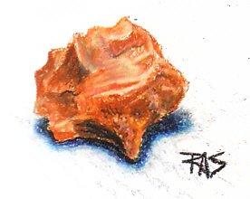
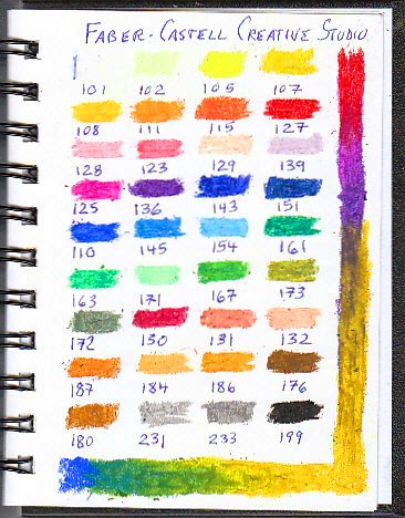
In handling, their texture is medium-firm, close to Erengi. Pigment saturation and opacity are better than Reeves by quite a lot, but not up in the range of Cray Pas Specialist and other artist grade oil pastels. Closer to those than to Reeves though. I found the blending excellent and the hues chosen are good mixers. I used some complements in with the earth tones and created mixed colors in the shadow on my stone drawing. White is strong and opaque, so is black. These are a good choice for student grade oil pastels. Color numbers are on the sticks and listed by name in the box lid. Many are named after well known pigments but pigment composition is not mentioned on the wrappers or the box. Neither is lightfastness. We'll have to find out how they rate for lightfastness in the independent tests I'm starting this Spring. In the meanwhile, these are a good choice for students, illustrations, sketchbook work, practice and studies. Below is a color chart of the 36 color range with color numbers under the swatches. Both my example painting and this color chart are on white ProArt wirebound sketchbook paper.

|


